This chart shows the essential elements for the application of the visual identity of InSimo. It aims to create coherence in all public documents of the company.
Logotypes are used in pyramidal or horizontal version with or without slogan according to utility. They may in no case be modified. Proportions, colors and typography are immutables. They are used as such on all communication media.
Design:
In most cases, logotypes are used in their complete version (logo and slogan). For layout worries, simplified logotypes can be used.
Color:
It is recommended to use the official color of InSimo for all documents (R 136, G 26, B 90).
Logotypes can be used on white or transparent backgrounds, always respecting the colors of InSimo.
Minimum sizes:
Rectangle logotype with slogan : 30mm wide.
Rectangle logotype without slogan: 30mm wide.
Square logotype with slogan: 20mm wide.
Square logotype without slogan: 20mm wide.
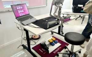
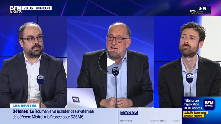


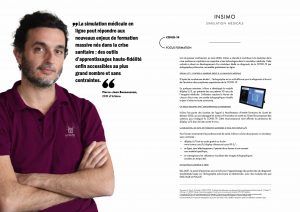

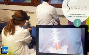

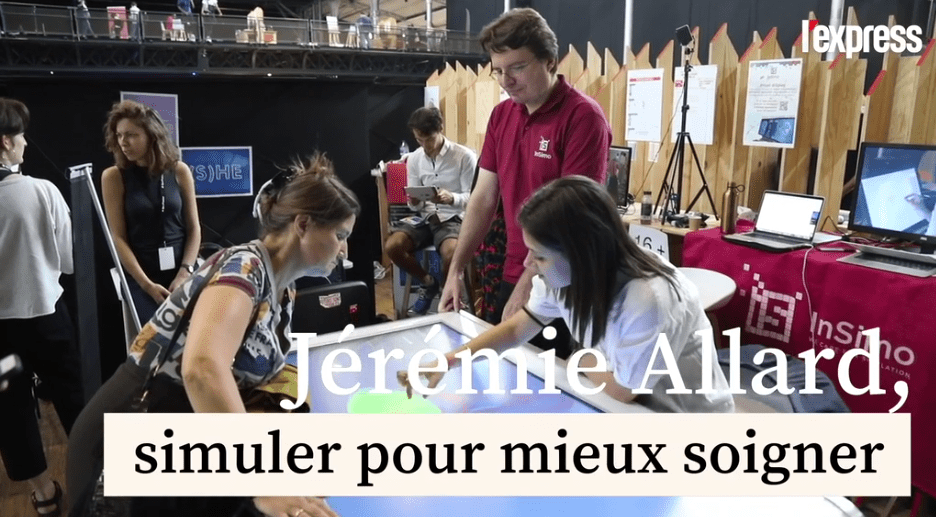
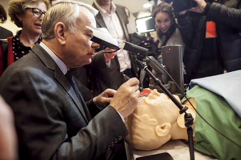
 Article published in the reference pharmaceutical specialized press about research lab technology transfers allowing innovation in industrial companies.